Season 2: Episode 7
A Canal Charmer
South Bethany is a beach town that positively oozes charm and relaxation. Tucked within a network of little canals, South Bethany is both oceanside and bayside – a combination that’s hard to beat.
Karin and Chris have been vacationing in South Bethany for over two decades, and they finally bought a beach house in their dream location: right along a canal. But while the house’s position was ideal, the house itself needed a serious update. Its interior and exterior were stuck solidly back in the 1980s. It was time to make this home a canal charmer!
Karin and Chris named their house “A-Boat Time,” and they aspired to design a sophisticated, nautical-inspired home. They have two college-aged kids, and it was important to them to create a place where their family would want to spend time – now and for years to come.
Exterior
Problem: The house had no curb appeal to speak of. It looked like a big, drab concrete block, lacking in charm and character – more suited to an industrial park than a beach home! Chris and Karin felt underwhelmed whenever they pulled up in the driveway, and we had to change that.
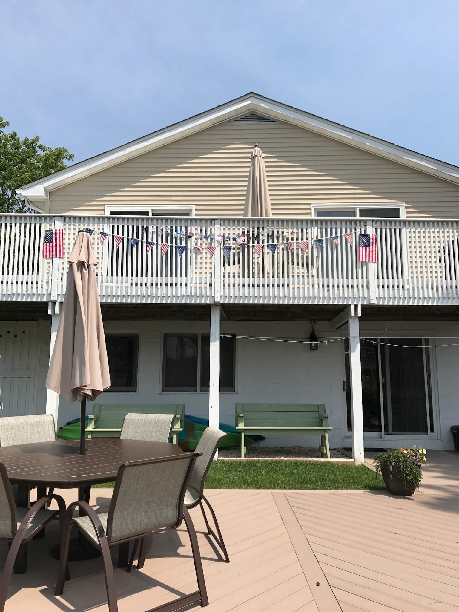
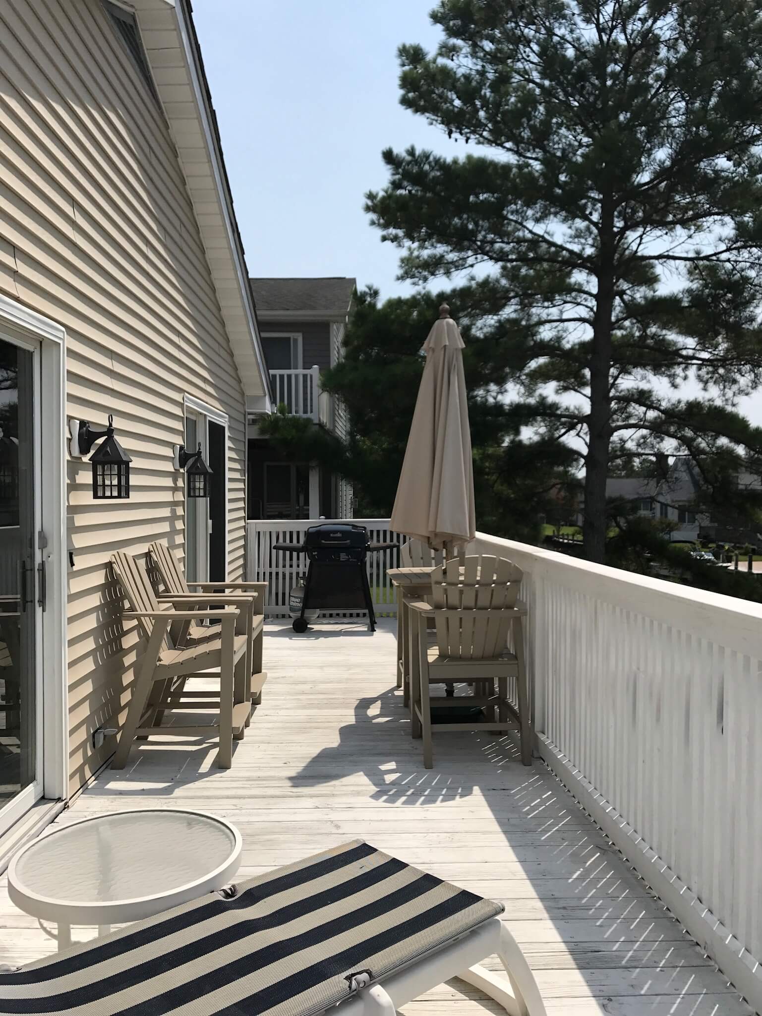
The exterior also featured some awkward, underused areas. There was an exterior staircase no one ever used and an utterly scary outdoor shower (the words “torture chamber” came to mind!). And because there was no designated storage area, the family’s kayaks were cluttering up the outdoor space.
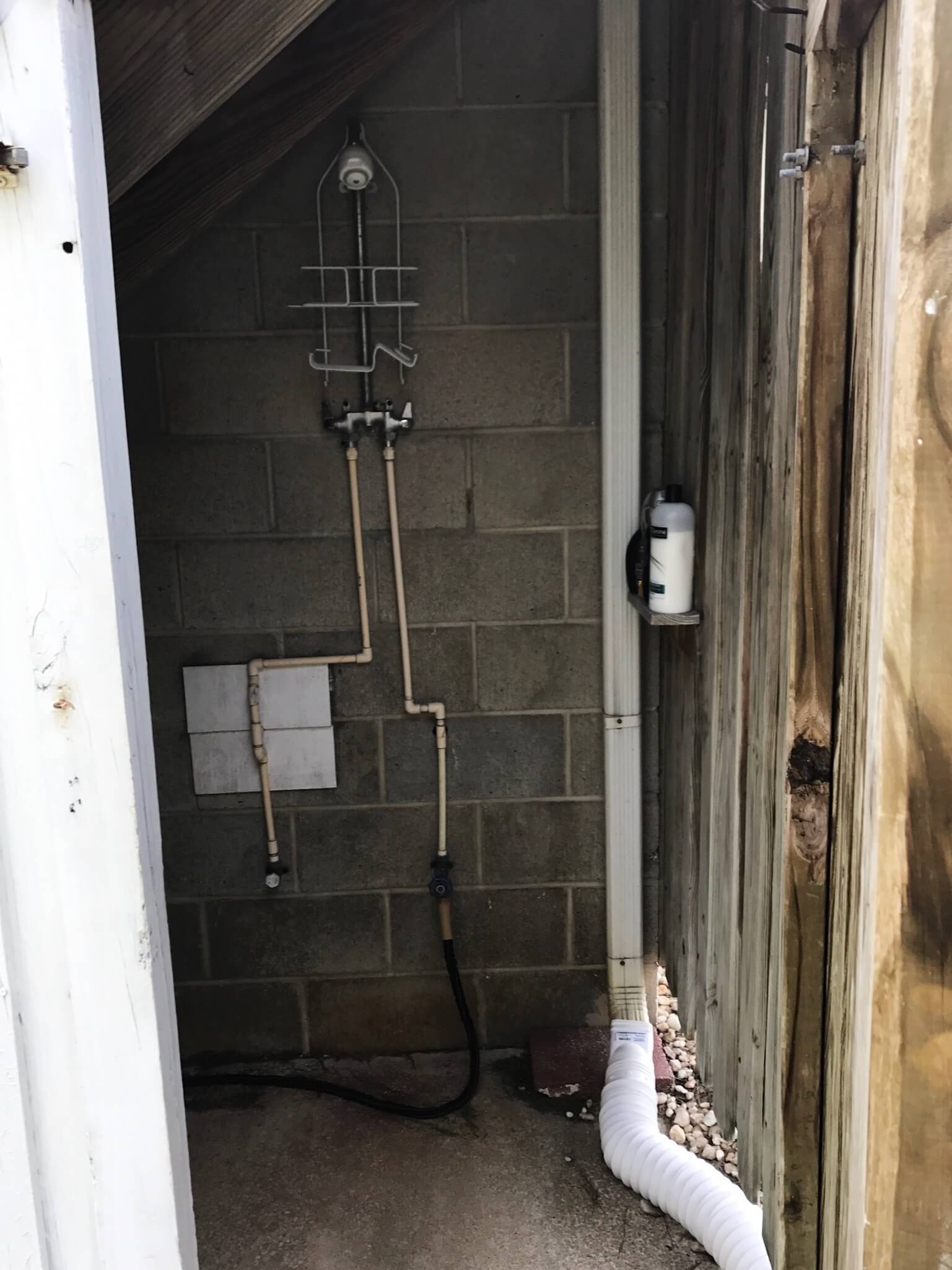
Solution:
I made it my mission to bring an elegant coastal aesthetic to the front of the house, so Karin and Chris would feel happy and proud every time they entered. I installed new vinyl siding, in a beachy blue, with white board and batten along the perimeter.
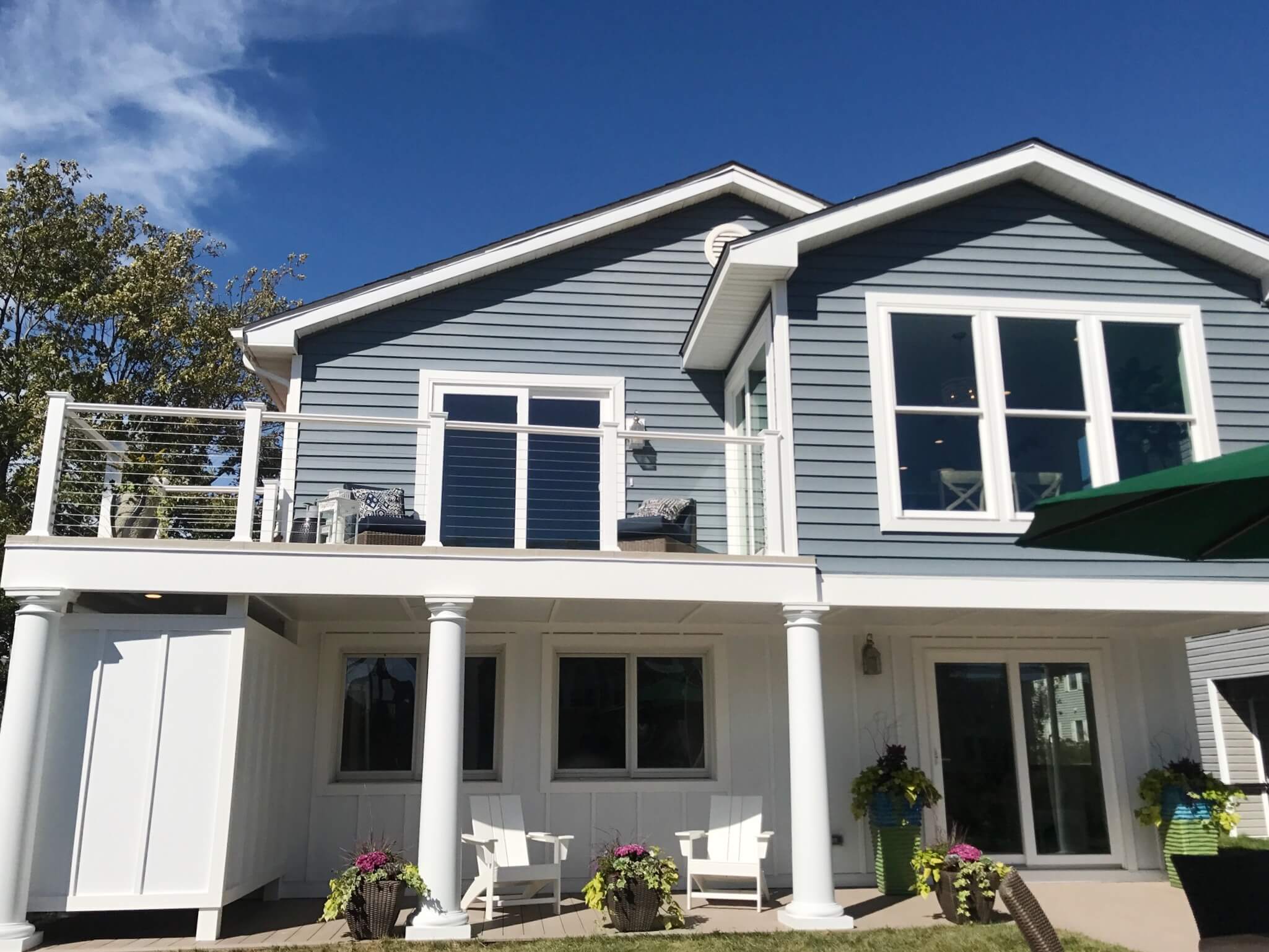
The neglected staircase wasn’t doing anyone any good, so I tore it out and used that space to build an outdoor storage closet. It’s roomy enough to stash kayaks, bikes and beach equipment.
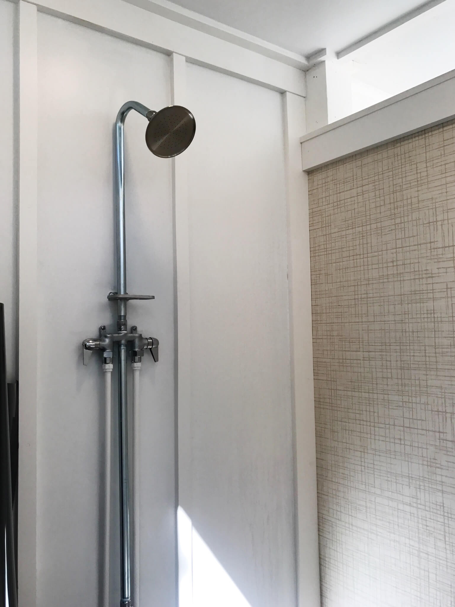
I moved the terrifying outdoor shower from under the stairs to under the deck, where it had access to much more natural light. I transformed it from bare bones to rustic-chic, incorporating a bench seat and special waterproof wallpaper.
Living Room
Problem: The problem with the living room started before you even got to the room. The stairs leading up to the second floor were a sad and dreary affair: dark wood paneling and no natural light. And the living room itself wasn’t any better. The paneled walls and popcorn ceiling brought on unpleasant ‘80s flashbacks and clashed with the room’s beautiful hardwood floors.
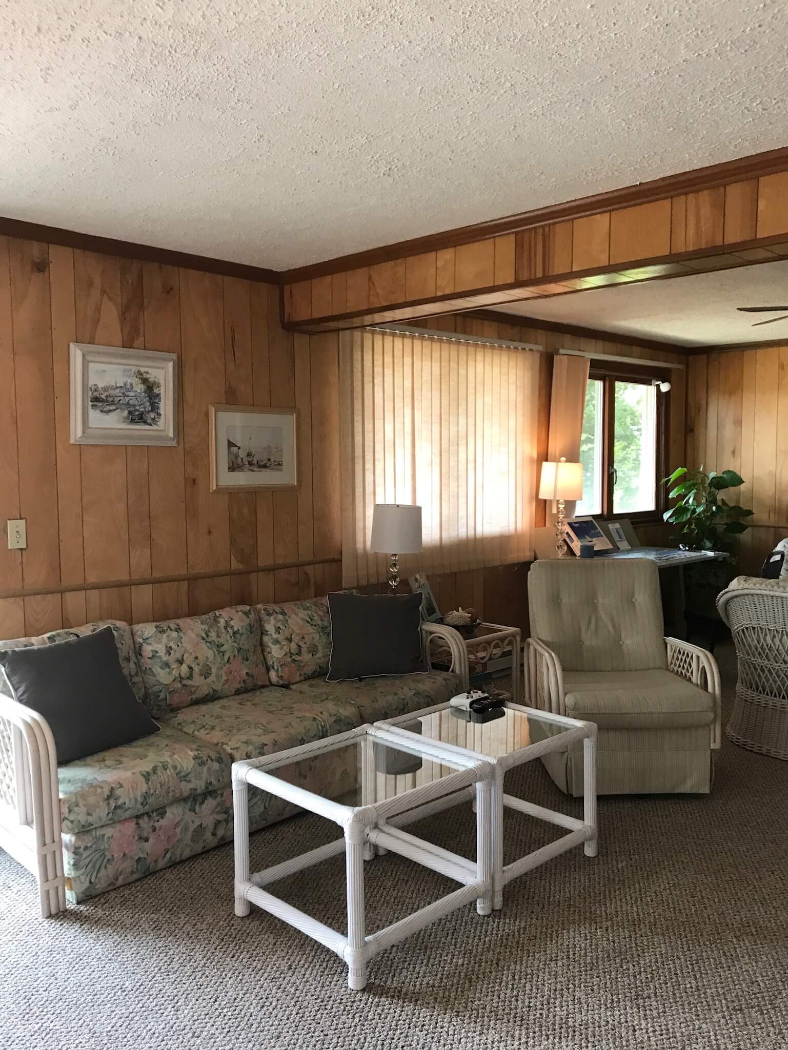
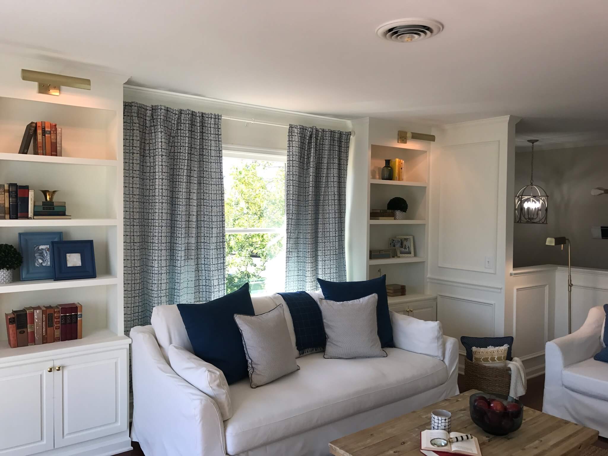
Solution: I knocked down the wall leading from the staircase into the living room, replacing it with a knee wall to let in a ton of natural light off the water. Instead of getting rid of all of the wood paneling on the staircase, I salvaged the bottom half and turned it into chic white wainscoting. I replaced the old handrail with a thick rope, a maritime touch that fits perfectly with the house’s theme.
In the living room, I left the hardwood floors in all their glory but repaneled the walls with sleek picture frame molding. I refurnished the room using gorgeous patterns and organic textures and added custom built-in bookcases around the windows. The finished space is modern, warm and stylish.
Kitchen
Problem: The kitchen was cramped and outdated, unwelcoming for both cooks and guests. There wasn’t enough counter or storage space, and the dingy linoleum, laminate and wood paneling was out of place next to the gorgeous canal views. The kitchen opened onto a narrow deck, but its strange shape wasn’t the best use of the space.
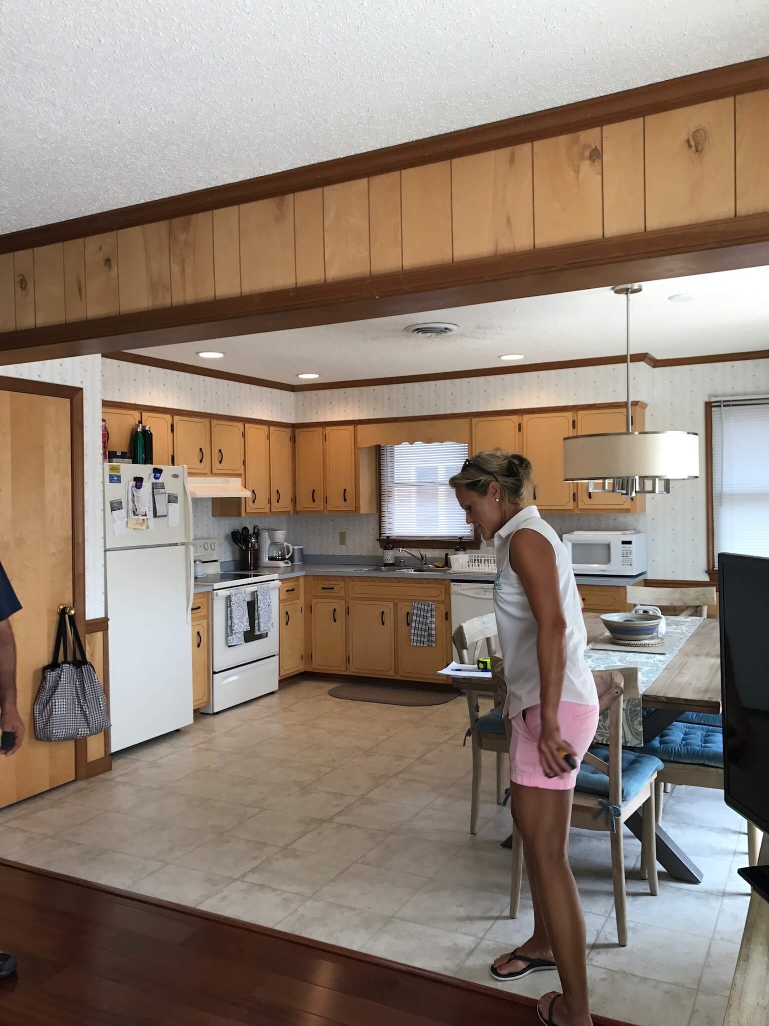
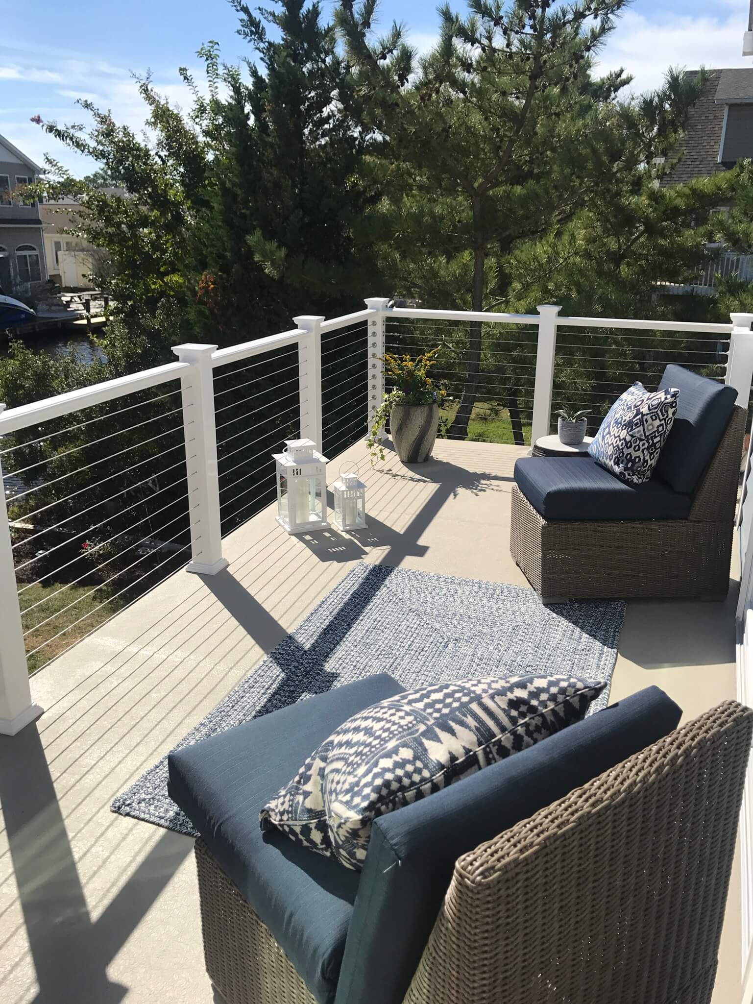
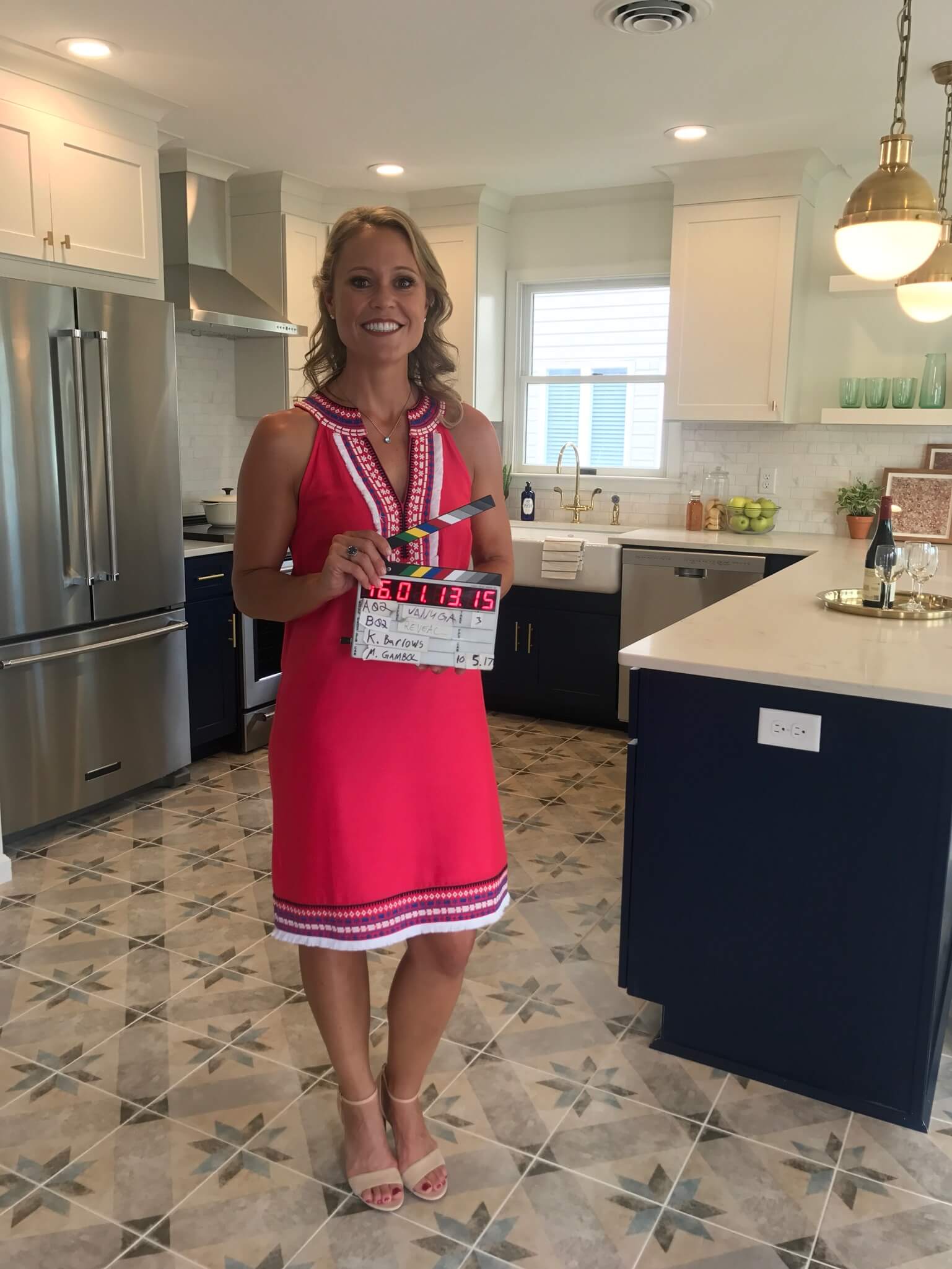
Solution: This room had so much unrealized potential! I expanded the footprint of the kitchen, enclosing part of the deck to create an airy indoor dining area with windows overlooking the canal. This one little change made the room look huge. The deck is now slightly smaller but a lot more functional – with plenty of space for grilling and enjoying a glass of wine. I installed stainless steel cable railing around the deck so the family can have unobstructed canal views.
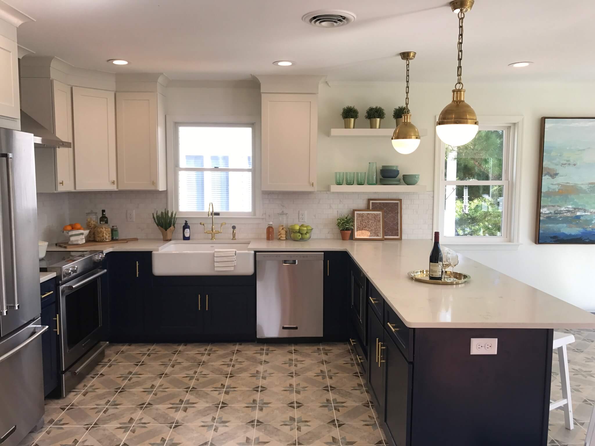
I wanted the seaside vibe to come to life in the kitchen. I painted the new cabinets a deep blue and selected a porcelain tile that blends lovely blues, greens, and whites. The final touches – brand-new countertops, appliances and a peninsula with seating – made the kitchen an inviting place to cook and gather.

Guest Bathroom
Problem: Between the ancient wallpaper and the unflattering fluorescent lighting, this guest bathroom was in need of a makeover!
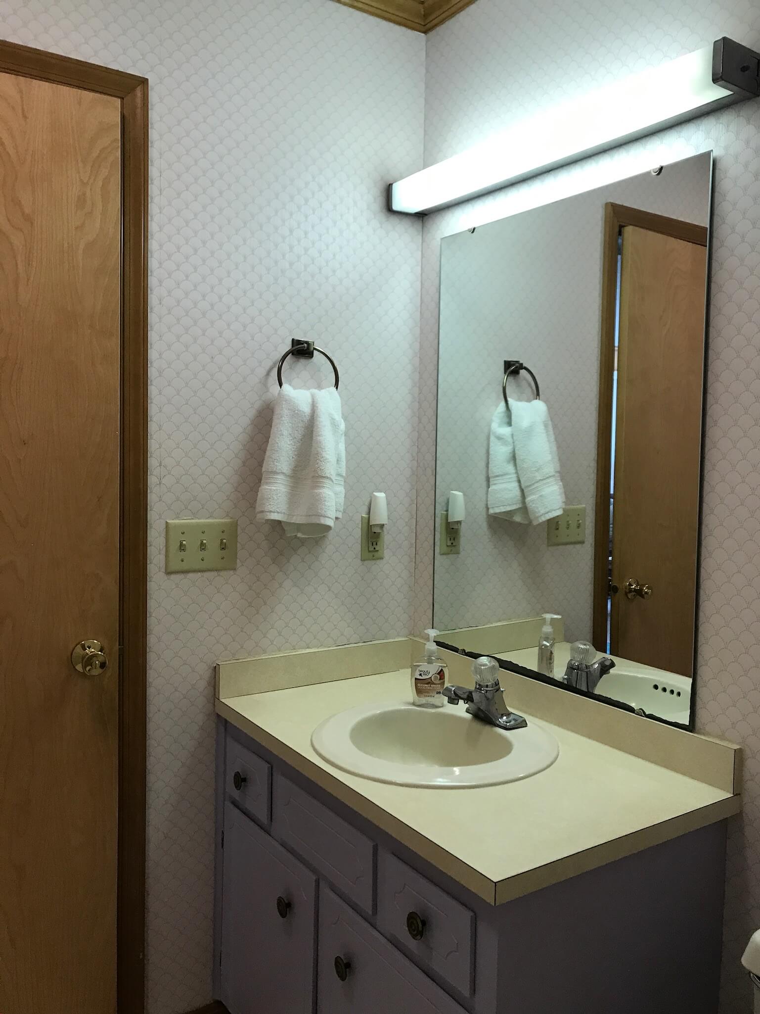
Solution: I carried over the polished look of the rest of the house into the guest room, including details like new sconces, wainscoting and picture frame molding. I swapped out the vanity for a pedestal sink, and installed a subway tile shower and a wood herringbone floor.
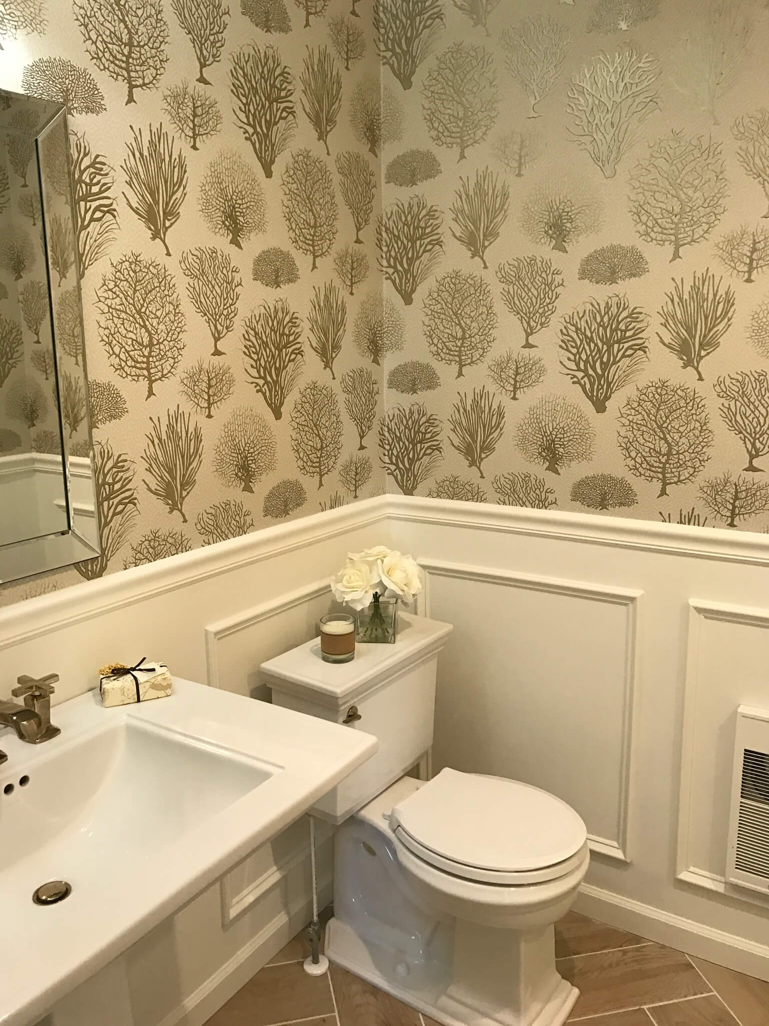
Master Bathroom
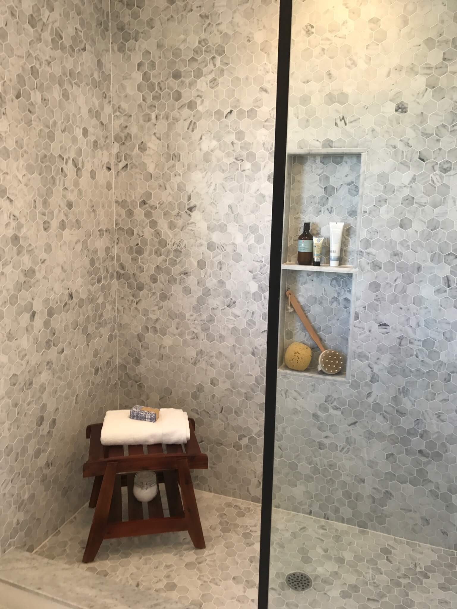
Problem: I couldn’t let the guest bathroom have all the fun. Chris and Karin’s master bathroom was small and congested. They deserved a bright, spacious room of their own.
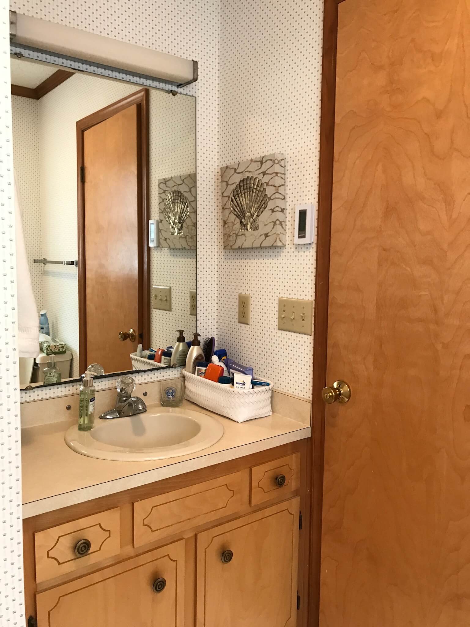
Solution: By stealing some square footage from the guest bathroom, I was able to expand the en suite master bathroom. A few feet made a big difference. New fixtures, a bigger shower and a more contemporary look completed the renovation.
I am so thrilled that Chris and Karin now have a stunning beach house that matches its incredible surroundings. It’s “A-Bout Time”
See you next week, same time (Monday at 9/8c) and same place (DIY Network)!

Learn more about the behind-the-scenes secrets on all my episode recaps. And tune in for two brand new episodes of #BigBeachBuilds every Monday night at 9/8c on DIY Network.

